Selecting the right color palette for your home can transform your living space, reflecting your personality and creating the ambiance you desire. In Canada, where seasons range from snowy winters to vibrant summers, choosing a color scheme that complements the changing environment is key. Here’s a step-by-step guide to help you select the perfect color palette for your Canadian home.
1. Understand the Basics of Color Theory
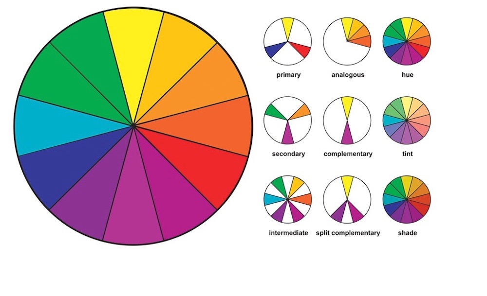
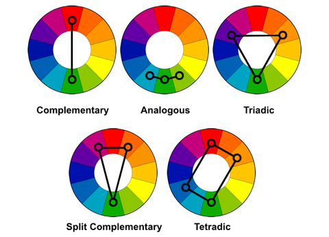
Before diving into specific colors, it’s important to understand color theory. Colors are divided into three categories: primary, secondary, and tertiary. They can also be categorized as warm (reds, oranges, yellows) or cool (blues, greens, purples). Warm colors evoke energy and coziness, while cool tones create calm and spaciousness. Understanding these basics will help you choose complementary or contrasting colors effectively.
2. Consider Your Home’s Location and Lighting
Canada’s diverse geography and varying daylight hours can significantly influence your color choices. For homes in regions with long, dark winters, brighter tones like whites, pastels, or warm yellows can maximize light and create a welcoming atmosphere. Conversely, homes in sunnier areas might benefit from cooler shades like navy blue or forest green to provide a refreshing contrast to bright daylight.
Tip: Observe how natural light flows through each room at different times of the day before finalizing a palette.
3. Align with the Seasons
Canadian homes often draw inspiration from the country’s stunning seasonal changes. For a winter-inspired palette, choose cool whites, icy blues, and soft grays. If you love fall colors, warm tones like burnt orange, deep red, and golden yellow can bring a cozy vibe year-round. Summer-inspired palettes might include fresh greens, sunny yellows, or sky blues.
4. Match Colors to Your Home’s Architectural Style
Your home’s architectural style can guide your color palette. A modern, minimalist home may suit neutral tones like white, beige, or gray with occasional pops of color. A rustic or farmhouse-style home pairs beautifully with earthy tones such as browns, creams, and greens. Victorian-style homes can embrace bolder shades like burgundy, emerald, or deep navy.
5. Select a Dominant, Secondary, and Accent Color
A well-balanced color palette typically includes a dominant color (used on walls or large surfaces), a secondary color (for furniture or rugs), and an accent color (for smaller decor pieces like cushions or artwork). For example, a Canadian winter-inspired palette might feature white as the dominant color, light gray as the secondary, and icy blue as the accent.
Pro Tip: Use the 60-30-10 rule—60% dominant color, 30% secondary color, and 10% accent color—for a cohesive look.
6. Use Color to Define Space
In open-concept homes, which are popular in Canada, colors can help define different areas. Use darker tones to create cozy corners and lighter shades to make spaces feel expansive. Contrasting colors can separate dining and living areas, while a unified palette can make the space flow seamlessly.
7. Choose Colors That Reflect Your Personality
Your home should feel like you. If you enjoy vibrant, energetic spaces, consider bold hues like red, orange, or teal. For a calming retreat, stick to soft blues, greens, or neutrals. Test samples on your walls to see how they make you feel in the space.
8. Factor in Furniture and Decor
When choosing a color palette, consider your existing furniture and decor. A bright couch, colorful rug, or patterned curtains can inspire your choices. Alternatively, neutral walls provide a blank canvas to showcase bold furnishings or artwork.
9. Test Samples Before Committing
Paint colors can look different in-store than they do on your walls. Test samples on multiple walls and observe how they appear in different lighting conditions throughout the day. This step ensures you won’t face any surprises once the entire room is painted.

10. Stay Open to Inspiration
If you’re unsure where to start, look for inspiration online, in magazines, or even in nature. Platforms like Pinterest or Instagram often feature Canadian homes showcasing trending palettes that balance modern design with seasonal elements.
Final Thoughts
Choosing the perfect color palette for your Canadian home doesn’t have to be overwhelming. By considering factors like light, location, style, and personality, you can create a harmonious space that reflects your taste and enhances your home’s atmosphere. Whether you’re refreshing one room or reimagining your entire home, the right colors can make all the difference.